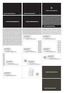
Business cards:
Open publication - Free publishing - More letterhead
Compliments:
Front-
Back-
After pitching these ideas to Lorin, she gave me some feedback as to what direction to go in. She liked the pattern on the back of the compliments slip and letterhead but though it was too much on the business card as it was making it look too busy. And she said she liked to pattern better in a larger scale as the smaller pattern makes your eyes go funny. She picked out these two business cards that she likes the most and asked me to reproduce them in black and white inverses and also double sided, on a thicker stock. They are both different versions of the usage of the symbol so she wanted me to further experiment with applying them before she chooses which she likes better
The logos she chose where both the centre aligned ones so I suggested that the logo could work better on the letterhead and compliments if it was centre aligned too so I would go away and try it. I also said I would experiment with the type for the contact info as it was Georgia and was clashing with the serif of the logo. Maybe a nice sans serif such as Gill Sans would work better.


No comments:
Post a Comment