Showing posts with label x/brand identity. Show all posts

Thursday, 1 March 2012

The Impossible Project

The Press Pack for - The Impossible Project - Polaroid PX film.

The black outer packaging has 'Impossible' subtly printed across the front using spot varnish and embossing. Within the pack there is a cd, information about PX film, sample packs (8 polaroid images), contact info.

http://trendland.net/the-polaroid-is-back/


Thursday, 23 February 2012

Anagrama

A great piece of branding by Anagram for a building named 'Sofia' designed by architect Cesar Pelli for One Development Group.

''Our task was to communicate such sophistication and exclusiveness to their potential buyers. Therefore we created an identity that was the exact opposite of what we usually see for this kind of project. 

Sofia's identity is formed by three very important axes:
Logotype: the keys and the coat of arms are inspired by San Pedro's coat of arms. 
Typography: we developed a custom typeface designed especially for Sofia, it is inspired by british san serifs. 
Layout: the text and information arrangement is inspired by the typographical treatment used before grids were popularized by the swiss grid system. 

Both the attention to detail and the brand's elements convey the greatness of Sofia's architectural project. ''


Tuesday, 31 January 2012

Bravo Company

pauline.ning is a fashion brand. The design are non-intrusive so the clothes stand out. They reused emboss mold to bring the production cost down.


The designs are simple and elegant, and do not take attention away from the clothes. This is reflected in the type used being simple, clear and clean.


 Business card, tags, flyer


 Look-book


By Invite Only is a handcrafted jewellery brand with a rustic art direction. To which they gave an old circus theme. The name card is in a carnival ticket style.


The type used name of the collection contrasts with the type used for the brand name, yet is still in keeping with this carnival/circus theme. The luxury aspect of the jewellery is represented within the use of print finish such as foiling and laser etching into wood, in these well considered designs. They are kept quite simple and you can see where were the circus element has been adapted in a subtle way. I really like the composition of the invite, and I also like the format of the look-book, I think this would work really well as a promotional giveaway for the fashion identity (brief 1)


 Necklace coilers


Look-book and invitation

Wednesday, 25 January 2012

Why Not Associates

Envy - Corporate identity, for London based post production facility. Showing the identity running across a range of deliverables: including letterhead, business card, compliments slip, cd packaging, note books, bellybands, video labels and packaging, tags. 

Gives me something to consider when creating the brand identity for the fashion designer, to experiment with how the identity can be used across a range of promotional materials in different ways.


The Reel - Corporate identity for xtreme information's media resource service showcasing commercials and promos. 

Nice bit of branding across the stationary. The editorial zines are very consistency, and vibrant.


Pigeons & Peacocks - 
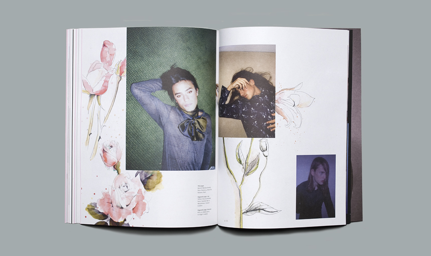
Third issue of the magazine created for the london college of fashion.

The magazine represent the work of students at the london college of fashion. This is relevant to my yearbook design brief as it is of similar content. I like the layout of the images with some working to the margins and other going off the pages. The yearbook is going to have to have different layouts to suit the work of the students, so that it shows their work off in the best way. This may include one large single images, or 2/3 showing different aspects of their work. So looking at how their composition works with in the grid system is something I need to experiment with.
I also like the cover of the magazine with the monotone images and the foiling.


Pigeons & Peacocks - 
Quarterly fanzine for london college of fashion showcasing students work.

These work as a fold out poster/zine. They are each very different yet keep a consistency through the use of the same grid system, typeface and format.


London College of Fashion -
Prospectuses 09 - Including cover, bags, and spreads.

Use of colour to distinguish each different publication. When thinking of how this could relate to the yearbook, the use of packaging for it could be visually interesting, either a bag or even a poster wrap.