Showing posts with label x/logo. Show all posts

Tuesday, 17 April 2012

Brief 05 - Jewellery Brand - Name

After brainstorming some more names and trying to come up with some made up words and words that are a mix of two words. I came up with Cavello Row, which I feel is quite sophisticated and luxury, which is relevant and what I am after. It makes it sound like it is the place to go for the perfect diamonds. A destination rather than a describing word, which works well as I want the brand to be for a boutique jewellers, so would be a unique one off. The packaging and identity needs to exude as much luxury as possible, as it needs to attract women who aspire to buy from the jewellers, therefore they would be after a brand experience. The packaging should be for keepsake and of high quality.

Before finding the name Cavello Row, I went through a lot of similar sounding names and also made up a person's name 'Ella Savello', as a lot of jewellers are named after the people that set it up.


I am going to work with Cavello Row - Diamond Boutique, as it is the most catchy and sounds the best.

Using the Rockvault idea with the Diamond as the V, I adapted this to the Cavello Row to subtly emphasise that the brand is for diamonds. Rather than the V, I experimented with the W, which is the last letter therefore out of the way and not right in the middle. It seems to work quite nicely. The fill of the diamond could also be changed colour to adapt to different ranges. E.g. Emerald - Green, Ruby - red.


The one I like the most is this:


A signature/trademark colour for the brand would work really well as the logo is not to overly empowering. For examples: Tiffany's uses a trademark turquoise/blue colour across their brand including their packaging which also has white ribbon bows. The colour would have to work well with the jewellery itself and not clash with diamond colours.

Other ideas I had to make the type a bit more bespoke:


 Not sure if I prefer the clean cut type, to reflect the precision of the diamonds. As I could add illustrative elements in other parts of the design, keeping the logo contrasting with a bold strong appearance.


Using the diamond brushes in photoshop, I used these to subtract elements format he bold typeface to give it a more fractured appearance, and light refracts the light:


I like the look of these rather than the logo with the diamond in the W. They would particularly look nice if they were foil blocked, as it looks as if it is a bit worn and breaking up. This could reflect the history of the diamond, the journey it goes through when it is begin formed and then gradually reaching the surface of the Earth.


I will come back to the logo.

Saturday, 10 March 2012

Brief 02 - Fashion Identity - Logo

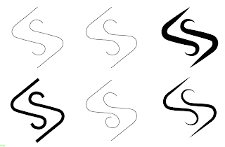
I vectorised the logo and changes the weights and some of the curves, so I had. few variations to trace form

1. I don't feel this logo was working very well. So I chose to not retrace this and develop it.

 2. I liked this an decided to retrace and develop the logo changing the line width at variations points, I will pitch this logo to Lorin, but I also need to work it with a typeface:


 3. I like this logo however I don't feel it to be as strong as the one with the longer lines coming form the S shape. So I chose not to develop this further.
 4. I rally like this and chose to develop the logo, change curved lines at the joints and changing the width and weights of the lines.


 5. Similarly with this, changing the line width:


 6. And also changing the edges and end points with this logo:


Thursday, 8 March 2012

Brief 02 - Fashion -Identity - Logo

I chose 6 logo ideas to take forward and develop, so I can present them to Lorin, and allow her to choose which she likes and what she thinks works best. I will experiment with using them with the typefaces too, to see how they work together. The logo's use the initials LS, in a subtle way, to represent Lorin Shepherdson. This is a norm in the fashion world to use initials as the logo, as people can recognise it easily and quickly relate it to the designer.

1. I chose this logo concept, that works with straight linear lines in a cubed form, representing Lorin's fragment structure and reflecting her architectural inspiration. The logo has potential to work well as a repeat pattern, and it can also be recognised form various angles. However, it may not be reflecting Lorin as a haute couture designer, as it doesn't seem to have that impact, and it isn't quite feminine. I will develop it and see how it can be used, to see if it works:


2. I chose this logo concept, with it fluid movement and subtle use of the LS initials, it can also be recognised upside down, to read in the same way. I will develop thus further as I think it has potential. However, it does remind me of cartoon of steam rising from a hot cup of tea! I will test this weights to see how this can improve:

3. I chose this logo concept again with the subtle use of the LS initials, however this time there are L's on each serif of the S. Which allows for readability at any angle. The logo is simple and elegant and has that fluid movement that relates to her Parisian architectural inspiration, that has the same curves. The use of their logo on an angle also gives a sort of diamond appearance, which represents importance.


4. I chose this logo concept, which is similar to the above however the Lines coming for the curves are longer, which frames the logo more. This gives a more 'sacred' feel to it, reflecting the exclusive designs. I think this logo has a lot of potential, and I am going to develop it to push it as far as I can. It has a 40's feel to it, as it is strong, bold and feminine:


5. I chose this logo design, again similar to the above but with a border of two L's. The logo works at various angles and the frame gives it that importance that it needs:

6. I chose this logo design, as I have shown it to Lorin previously and she has liked it, but i said I would develop it further, yet also offer her various other logo design (above). It is simple and feminine, and used the LS initials subtly.

Monday, 5 March 2012

Brief 01 - Stamp Design

Here are some logo stamp designs for the yearbook cover.
I have taken into consideration that they wanted the stamp more bold so that it stands out from the background image. Some of the earlier stamps used the Clarendon typeface, but I have experimented with using the Latin Modern Roman typeface so that it is consistent with that used within the yearbook. The line through the centre of the logo reflect the line used within the yearbook layouts too. I think this works better when the line extends out further that the circle as it gives it a more balanced appearance. They wanted the 'Original Rework' straight in the centre, with BA (Hons) Fine Art at the top, and Leeds College of Art at the bottom. 


They did not say if they preferred 2012 on its own or after Leeds College of Art so I sent the two below to Amy for her to work it with the cover image:


As an alternative to the glitch covers I designed some covers using the students imagery subtly in the background - as it wasn't fair just to use one students image on the cover. It isn't as visually interesting, but  Fine Art may see something they like, an it's good to give them the option.

Wednesday, 22 February 2012

Brief 02 - Fashion Identity - Logo Ideas

The logo needs to look classy, elegant, traditional with a modern edge. It will be used alongside a lot of photographic imagery so must not detract from the image. The typeface needs to be kept simple and clear, however a logo/symbol that can accompany the brand name 'Lorin Shepherdson', can be a bit more extravagant as a contrast. The logo needs to be used as a away of the audience identifying the brand as Lorin Shepherdson, so must reflect the style/nature of the brand.

A few typefaces I think may work well:

- PassionSans Light
- AW Conqueror Didot Light
- Big Caslon Medium
- Sanford Book


Lorin creates womenswear clothing designs that accentuate the female figure, using traditional fitting methods such as nipping in at the waist. I tried to incorporate this through the type, the 'R' in the first has a silhouette of the side of a womans' figure however i don't think it is obvious enough and looks quite gothic. The second nips the whole name in the sides with particular curved edges on the 'L' and 'N', which is quite subtle. The third with the first and last name over two lines and centralised has a slight slant with the narrowest part being in between the two words. The fourth is same as the third however with a slightly larger vertical scale.


An idea for how the woman figure could be applied to products:


The logo below is the initials of the designers name in lowercase and joined up. The detail within Lorin's designs means a lot of handcrafting has to be done. This logo idea takes uses this handmade style through handwriting. I quite like this as it is not too obvious.


Here is how the logo looks with the Sanford Book type. I think the contrast between the hand drawn logo and the digitally produced type works really well as it reflect the designs of the clothing, which are taken from old traditional fitting methods and translated into modern designs.


Saturday, 18 February 2012

Brief 03 - NHS - Logo Idea

The logo uses the a tulip image that represents health, and wellbeing, another image can be seen within the tulip of a figure holding its arms out. I played around with the stem of the tulip wrapping around the type as in a protective wreath to represent the community and that they the practice is their to help. However, it was starting to look like sperm, which could relate the practice to sexual health, which is not the main aim. So I chaged it to a straight stem to make it look more flower like, and I also added more petals. i think this could be developed further into an open flower to show the openness and welcoming nature of the practice. But for the pitch I will send across these initial logo ideas.