Showing posts with label Brief 02 - Fashion Identity. Show all posts

Sunday, 27 May 2012

Brief 02 -Fashion - Final Look book design

Here is the final look book that is ready for print:

After receiving the images from Lorin for the look book on the Friday and having to print it on Monday there wasn't really much time to keep coming back and making changes but I went off the previous designs I did with stock imagery, and Lorin was happy with the design and signed it off to to print. It will cost around £11/12 each to print at uni - which in the end she decided to do so she had one in time for the exhibition

I did some test stitching as it was just a single signature therefore didn't have to bind a few together like my design context book, so it just has a runner stitch down the side in black to blend in with the black cover:


Brief 02 - Look book development

Breif 0 - Fashion Identity - Final Artworks

Final designs for letterhead, compliments slip, swing tags, charms (lazercut), look book wallet, promotional flyer:


Brief 02 - Finals

Friday, 25 May 2012

Brief 02 - Fashion - Swing Tags

I designed some tags that are in the form of the square diamond shape that is reflective of the logo itself: however once printed and tested I didn't think these worked too well - maybe it was just the colour.

After speaking with Lorin she said that she wanted to include some gold charms with the swing tags that people could keep and even attach to bracelets. This would mean cutting the charms into some gold mirrored acrylic. I thought using black swing tags would probably work better with the goal charms with the name Lorin Shepherdson foiled onto them in gold. I changed the shape to rectangular strips and they now have more of an elegant feel to them:


Brief 02 - Fashion Tags

Tuesday, 22 May 2012

Brief 02 - Fashion - Business Cards

Lori asked me to get her some quotes for business cards, she wanted something with a nice finish to them to make them stand out and have a special quality to them - I goat quote from IST printing *shown in email) and also from team impression who quoted £200 for 100, which is a bit too steep. In the end I order 100 from moo.com, as they were £21 plus VAT and then extra for rush delivery which she wanted, think the total came to around £50 which was a lot better than the other two quotes - although without a specula finish. She will be receiving them next week in time for her exhibition. They are pretend on 350gsm matt laminate and have a smooth finish. Here is also the artwork for the cards: Fashion Business Card

Saturday, 19 May 2012

Brief 01: Fashion - Labels

Lorin sent off for her logo to be printed onto some labels so that she could stitch them into her clothing:

She printed the logo in white over black:


Thursday, 10 May 2012

Brief 02 - Fashion Lookbook Wallet

I thought it would be quite nice to design a wallet/slip for the look book, for when they sent out to people on request, to add that special touch to them. I chose black to work with the collection and brand identity, however it could also be worked contrastingly in white say for the alternation between spring/summer and autumn/winter collections

I payed around with the idea of using the pattern laser cut onto card so that the cookbook is slightly reveal underneath. I played with a few variations were a diamond square was cut through the centre to reveal the logo but I think I prefer if when the logo on the froth of the cookbook is not viable because it then makes you want to tai fit out of the wallet and see. As for the log pattern going over the edges, they re a bit flimsy so I would have to not let the pattern go over the edges next time:


Brief 02 - Look book Wallet

Wednesday, 9 May 2012

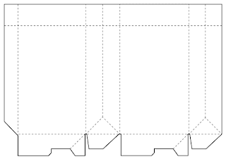
Brief 02 - Fashion - Bag design

Net: 
 Working to see who the logo could be used as the clasp n the bag:


Brief 02 - Bag

Brief 02 - Fashion Brand - Logo belly-band mechanism


 How it could look around the wrapping paper-


Here is what each piece is cut like (blue) with a little cut the the separate pieces attach with. As they overlap I don't want the logo to be visible underneath, so I am go gin to treat the logo as if it has been cut in two, not overlaid and intwined. 

The scale for the is 3mm width band with 100mm width logo, and the length of the band will have to vary for different size products. unless I can create a second faster at the end of the band that can be adjusted underneath...


Here are the bellybands ready for test printing - I have done both black an white versions: I am going to print on a thick matt card

Here is the wrapping paper design using the symbol pattern, I am going to print onto A2 tracing paper:


Brief 02 - Fashion Brand - Promotional Leaflet


Using the info from the look book I adapted it to the leaflet/flyer
Front side-


 Reverse side-

Brief 02 - Fashion Brand - Expanding deliverables

After the crit, it got me thinking about more of a range I could create for Lorin's fashion brand by adapting the style and identity I have already created, including:

- bag - different sizes (small, medium, large)
- wrapping paper
- belly-band for wrapping paper or stickers
- clothing tags
- clothing hanger


Tag sizes - I prefer the larger tag at 10mm diameter and 7mm. I chose the diamond square shape as I have already used this within the look-book as it is similar shape to the logo and has a 'sacred' feel to it. The logo could be printed on one and then a separate card of the same shape could contain the information:

The belly-band can offer various design possibilities. Either as a clasp, or something that fastens underneath. The logo symbol itself could be made into a clasp. However, I need to work out the mechanism for this.


 The clothing hanger could have the logo lazered onto it, or it could have a card cover that slips over the top, of which could be changed to match the collection. I need to get the measurements of the hanger before I move on with this, and also figure out the size accordign to the garment necklines, so that it can still be seen.

Brief 02 - Fashion - Business Card quote

I contacted Benwells for a business quote for Lorin, here is the email contact:


The quote seems a bit steep...
I have just contacted IST to see if I can get this any cheaper, and I also asked about alternate print finishes:


Tuesday, 8 May 2012

Brief 02 - Fashion Brand - bag design


The bag design simply with the logo on the outside and then a lip that fold inside the top of the bag with the pattern which works with the other collateral as it is a secondary element.


Brief 02 - Fashion Brand - Look Book - development

I got the concept text off Lorin which reads:

''Classic 1940's silhouettes and modern print combine in a collection that embraces the ideas of feminity and elegance. Sacred feminine aims to bring a decadent, couture feel to clothing and showcase and flatter a woman's natural shape.''


I worked this into the box shape:


 The '1940s' was making the box shapes look awkward so I changed the numerals into words, which I think works and fits a lot better...

I also incorporated the log pattern to the inside of the cover inverted in white from the green colour and also the opposite way round - I think the white logos over the green background work better as it adds more depth to it.
Working on the front:


 Workign on the back:

 Working with the pattern on the reverse of the cover and the full green colour on the inside pages:


I think I prefer the contrasting pattern over the green with the white page on the inside:


Here's how it works in the look book:


White cover:


Open publication - Free publishing - More fashion


Black cover:

Brief 02 - Fashion Brand - Look Book - development

Ultimately it will be Lorin to choose whether she prefers the text on a back page or if she wants it with each image, which could leave the last page for the contact information, so I designed who this could work:


I wanted to play around with the shape of the text boxes to get across this idea of begin 'Sacred Feminine'. I experimented with using the shape of the logo in the centre of the page for the concept text to sit inside, allowing white space around it - to give a sense of importance. This would also determine the positioning of the collection info, and the cover logo and the contact info at the back.


As I said I was giving Lorin the option of the image info, so I played around with what the final page could look like:

In the end I got to a design also working with the shape of the logo as a central focus, but this time with the images surrounding it rather than inside of it, this gives a nice sense of importance to the logo sat in the middle, enforcing the brand image. This is the one I prefer as it keeps a consistency through the book, and the idea of it begin sacred.

Monday, 7 May 2012

Brief 02 - Fashion Brand - Look Book - design ideas

I created a simple design to show the flow of the look book, and sign eI do not yet have the imagery from Lorin's shoot, or the text information I have used dummy text and images form the internet to experiment with. I used the green colour on the inside of the cover to give it that striking edge (the colour is from the collection), and the image info is all collated on the last page. Lorin said she would would like the cover in black or white.

Saturday, 5 May 2012

Brief 02 - Fashion Brand - Stationary - final designs

Here are the set of designs for stationary: business cards, letterhead and compliments slip, that Lorin has chosen to be her finals. Now I just need to decide the print process and stock for the business cards, and print the letterhead and compliments slip onto some matt stock. I also need to get some quotes for the business card for a quantity of around 100-200, and I need to get an envelope net. The stationary works well as a set with the business cards contrasting in black to the others in white.

Business Card:
Front:
 Reverse:

Letterhead:
Front:
 Reverse:

Compliments:
Front:
 Reverse: