Showing posts with label x/publication. Show all posts

Thursday, 3 May 2012

Chapter Press

Some great brochures printed by Chapter press, with some good use of stock and print process.

I really love the use of opaque stock inside the book which allows you to see through onto the next page - in this case they have pretend a red image onto what looks like tracing paper to get this see through effect. I also love the embossing on the supplement, when thinking of my D&AD brief this could be used as a subtle change to each publication.


Wednesday, 18 April 2012

BIBA Book

A great publication for BIBa - I found this on the internet I just love the simplicity of the design, as well as it begin sophisticated and luxury. The foiling and colour edging is also a nice touch, which gives it a special finish. The scale of the book is also a good size as it fits a double page spread on a A3 sheet which lowers print costs. It is similar to what I would like for my Design Conext publication has it is very high end, high spec.


Most people will be familiar with the name Biba. Starting as a mail order company in the early sixties and becoming a global fashion phenomenon by the early seventies, Biba became one of the great symbols of swinging London. Biba closed its doors in 1975 but was relaunched in September 2010 (exclusively at House of Fraser).
A lookbook for the re-launch was designed and produced by London based creative agency, Exposure.

The size of the book is 235x170mm, portrait, perfect bound. The 4pp cover is on Notturno 300gsm (a black board) and is hot foil blocked in gold on the outside cover. The 52pp test is printed on our Omnia 200gsm which, although quite heavy for text, really works because of the gilt (gold) edge which runs around the page edges.

Art Director on the project was Simon Boniface. The photography is by Leandro Farina.Print and print production including the superb foiling and gilt edging was by Chapter Press

www.chapterpress.co.uk


http://justinsamazingworldatfennerpaper.blogspot.co.uk/2011/10/biba.html

Friday, 2 March 2012

Alexey Brodovitch

Alexey Brodovitch was an influential editorial designer in the 50's, I particularly like the way in which he manipulates the form and shape between the image and text.

Alexey brodovitch was an artist, graphic designer and photographer. However, he was most famous for his art direction, primarily for the magazine Harpers Bazaar. He was a aesthetic entity whose permanent influence was perceived along the entire visual arts. His style of combining elegantly set typography with new and experimental trends in photography became widely popular in the 1940's and 50's, helping to keep the magazine at the forefront of its field in a swiftly changing world.


''Brodovitch was the first art director to integrate image and text. Most american magazines at that time used 
text and illustration seperately, dividing them by wide white margins. Brodovitch cropped his photograhps, often off-center, brought them to the edge of the page, integrated them in the whole. He used his images as a frozen moment in time and often worked with succeeding pages to create a nice flow trough the entire magazine. This brought a new dynamism in fashion layouts.


The typeface he preferred was Bodoni, but when needed he switched to Stencil, Typewriter or a script. He matched the typeface with the feeling or with the need for an appropiate effect. Legibility was not his primary concern.

His layouts are easily recognized by his generous use of white space. Colleagues at other magazines saw his sparse designs as truly elegant, but a waste of valuable space.''


AlexeyBrodovitch


This spread from 1935 shows the integration of all graphic elements. Brodovitch accentuates the fluidity and movement of the images by using repetition and diagonal and horizontal stress. He uses the contacts like frames from a film and creates the illusion of movement and spontaneity across the left-hand page. The strips of film overflow onto the opposing page, as if the dancers have twirled across the spine of the magazine. The enlargement on the right-hand page depicts the grand finale of this dance numer.
Following the idea I had about using the fitting technique of the garments and the facts that they accentuate the female figure could be adapt to the style of the cookbook e.g with the curve of the text:


 This idea could also work across typeface,  I used the hourglass curves of the female figure to came up with this typeface idea, this could be developed through changing weights.


Wednesday, 22 February 2012

T Magazine Supplement

T Magazine is the supplement to The New York Times magazine. Here are a few of their covers. Artists and Designers are invited to interpret the franker T in any way. They each portray the T in distinct style yet work together and are consistent with the letter.

The supplements I am designing for, need to work together and still be consistent through the use of the circle. The circle could be made up of letters from the professionals name, or of something that is relevant to them. This could also be through using colour.


Tuesday, 21 February 2012

Circular 16 - The Typographic Circle

''Lippa has designed the last nine issues of Circular and delights in creating each from scratch. In this issue the close up of the title on the cover through the contents pages and dividers indicates a desire to focus on the detail of the work. The use of Courier as the default font set without justification is designed to act in contrast to the typographic perfection of the featured work.''
http://pentagram.com/en/new/2010/01/new-work-circular-16.php

The cover of Circular 16:


We Made This

WeMadeThis

Benwells Samples Box


''As part of our work on the new identity for print specialists Benwells, we designed an A5 samples box to send out printed samples.
It consists of a cardboard outer that is silk-screened in green on the inside (and smells gorgeous and printy as a result), and which contains a crisp white box that holds their (lovely) samples.''


 The cardboard outer holding the white samples box
 The white samples box, with a blind embossed logo, and foil-blocked tag line
 The tray from the samples box
 The tag line foiled onto the cardboard outer
The contact details on the back of the samples box


I really like this piece of design, although the design itself is quite minimal, it is effective through the use of stock, colour and print finishes, creating a clean but striking solution. The contrast from the packaging to the box itself is a nice touch as the rough cardboard packaging protects the crisp clean box inside.

Cardon Webb

A series of book covers for Oliver Sacks designed by Cardon Webb.

This clever design work really, each book cover has its own image that represents what that particular book entails, but also has a background image that works across the series of books that once placed together form an image of a human head. The contrast between this black and white image against the colour damages for each separate book, means that you are primarily drawn to the colour and what that book is about, but then secondarily the image thats works across them all is apparent. It also keeps consistency within the designs through the use of typography and background colour.

Friday, 27 January 2012

Guerilla


'GONE required a high impact and high value document to celebrate the successes and provide a communication tool for the procurement of further European funding streams.
An oversize format was chosen to give the brochure standout and was created as a modular piece to have greater flexibility and longevity. It showcased individuals and their experiences through powerful black and white portrait photography and emotive copy, this was reflected in the brochure title, ‘Getting below the surface’.'


Wednesday, 25 January 2012

214 magazine

A magazine promoting New Generation Fashion designers showing during London Fashion Week. Magazine in two sections, outer, and smaller insert, dividing up content. Photography by Ben Toms.

Taking some inspiration for the fashion look-book and promotional material for Lorin. I really like the concertina fold leaflet, this could work really well for showcasing her collection as something that people can keep.


Why Not Associates

Envy - Corporate identity, for London based post production facility. Showing the identity running across a range of deliverables: including letterhead, business card, compliments slip, cd packaging, note books, bellybands, video labels and packaging, tags. 

Gives me something to consider when creating the brand identity for the fashion designer, to experiment with how the identity can be used across a range of promotional materials in different ways.


The Reel - Corporate identity for xtreme information's media resource service showcasing commercials and promos. 

Nice bit of branding across the stationary. The editorial zines are very consistency, and vibrant.


Pigeons & Peacocks - 
Third issue of the magazine created for the london college of fashion.

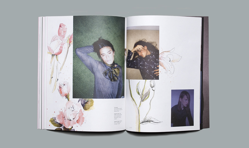
The magazine represent the work of students at the london college of fashion. This is relevant to my yearbook design brief as it is of similar content. I like the layout of the images with some working to the margins and other going off the pages. The yearbook is going to have to have different layouts to suit the work of the students, so that it shows their work off in the best way. This may include one large single images, or 2/3 showing different aspects of their work. So looking at how their composition works with in the grid system is something I need to experiment with.
I also like the cover of the magazine with the monotone images and the foiling.


Pigeons & Peacocks - 
Quarterly fanzine for london college of fashion showcasing students work.

These work as a fold out poster/zine. They are each very different yet keep a consistency through the use of the same grid system, typeface and format.


London College of Fashion -
Prospectuses 09 - Including cover, bags, and spreads.

Use of colour to distinguish each different publication. When thinking of how this could relate to the yearbook, the use of packaging for it could be visually interesting, either a bag or even a poster wrap.