Friday 30 March 2012
Brief 02 - Fashion Brand - Logo
Lorin was happy with the logo she liked in the meeting, and requested it as she wanted to order some labels to stitch into her garments...


Brief 03 - St Martins - Signage and Wayfinding
Looking into the signage and way finding for the Practice I tried to incorporate the logo somehow. But maybe this looks a bit too corny so instead I just worked with the white and turquoise colour in the same typeface a the logo Myriad Pro. I tested creating the logo out of acrylic and it turned out really nice, I cut the logo out of white acrylic and over layed it on some turquoise acrylic so that the logo can be seen. This could be the same concept for all the signage:
Signage
Signage
Thursday 29 March 2012
Brief 06 - Design Context Presentation 02
Here are the slides form my presentation.
Since the first presentation I have focused down the content of the publication and now have a clear direction to what I need to do and what I need to include:
Since the first presentation I have focused down the content of the publication and now have a clear direction to what I need to do and what I need to include:
Wednesday 28 March 2012
Brief 07 - End of Year Show
Me and Becky Tipping decided to come up with a concept pitch for the End of Year Show. It was literally a few hour brief but got us thinking quickly and designing so I think it was worthwhile even if it doesn't get chosen.
We decided to use the phrases 'Catch of the day' and 'A wave of fresh new creatives', to give the sense that the end of year show being a trade show to get us out into industry and find placement, is a place where people form industry come and pick up talent, and they could find themselves finding their own catch of the day. For this we used a nautical theme, playing with the idea of sailors, using bleu, white and black, in bold typefaces:
EOY Show Pitch
Monday 26 March 2012
Brief 01 - FA Yearbook - Problems with images
I spoke to the FA team about the images that we came across that are either not good enough or are they don't exist:
- Rachel Airy - resend image (quality)
- Sameena - resend image files in another format (can't open them)
- Dan Eccles - need an image
- Christopher Frietag - resend image (quality)
- Venice Gent - resend image (quality)
- Adam Jenkins - need new image
- Craig Shaun Malcolm - need new image
- Simon Mann - need new image
- Harriet Newcomb - need new image
- Rebecca Norman - need new image (quality)
- Jordan Peers - resend image (quality)
- Laura Smith - new image
- Elizabeth Trainer - need new image (quality)
- Karoline White - new image
- Charlotte Wilson - resend image (quality)
Brief 01 - FA meeting
Notes and decisions from the meeting:
Special Projects:
- use of swirl - try within layouts
- sepia image - gives a feel of history
-use of colour swirl
-could be different swirl of colour from cover for each project
-or could use a duotone - using a colour from the cover swirls - different for each project
- gradient from colour swirl into sepia image
Cover:
- double image - front and back
- spine - colour from swirl
- printed on Satin - all 3 cover designs
- spine colour on inside of cover - or taupe background colour
- welcome - same colour as?
NEXT MEETING: TUE OR WED PM?
Brief 03 - St Martins - Logo development
After receiving the feedback from Camilla that they liked the logo but felt it was too feminine, as it was using the flower, and that they liked to have a reference to family, I readapted the logo. Fro this I still used my original design but drew the flower as a three so it looked like a family and then I tried to work the surrounding area, for example making it look like a the (family tree), or using the shape within a circle to represent unity. I think for a GP Practice this one works really well as it is is simple and clear and the logo could be recognised easily. I also got the feedback that she preferred the turquoise colour scheme so I played around with different colours before deciding on the final colour which i spright and fresh to work nicely with their new location (last image)
St Martins Logo
St Martins Logo
Friday 23 March 2012
Brief 02 - Fashion Brand - Logo
I took some logo designs to show to Lorin to get her opinion on what she thinks works. I showed her a few type options and also a range of logo that utilised the symbols. I have marked off in red squares which she liked the most.
In these examples of type she was particularly drawn to the ones with the curves in the O's, this was a subtle hint towards the female form, and also attention to detail. The typefaces are simple and elegant, and she had requested a serif typeface as she felt they are more traditional and classic, and she feels they reflect her designs.


I also showed her a few examples of how this could work across the business cards, using various colours from her Sacred Feminine collection, of which she preferred the black and white versions, or maybe a colour muted down on a low opacity.

Brief 01 - FA Yearbook - meeting
Design decisions form Fine Art
cover - without text just on spine
layout - consistent or move around - varied
images -quality - not good enough - blurred when printed - need FA to rephotograph and resend
We showed them a variety of cover colour schemes for the spun image
- they said they liked green the least - but wanted to see the blue and red ones printed properly and too scale so they could get more of a feel for them before deciding.
They also want 3 of the spreads printing with the cover
Sheila and Andrew's essays - need emailing through to us
Variations with layout - text
Gammut - each image - speak to Miek in bubble - converting from RGB to CMYK
NEXT MEETING MONDAY - 11AM
Thursday 22 March 2012
Brief 01 - Yearbook - Student Pages Layouts
After combining the layouts together, I checked to ensure constancy across them all.
This included:
- Student name titles in Latin Modern Roman Bold 16pt
- Body copy at contact info in Helvetica Neue 1pt, with 15pt leading
- 3mm bleed on images
- Image positioning
- 132 pages structure:
- pg 1 - Welcome - ethos
- pg 2-3 - Contents
- pg 4-5 - Essay - andy
- pg 6-121 - 58 x Student double page spreads
- pg- 122-129 - 4 x Special Projects double page spreads
- pg 130-131 - Thanks
- pg 132 - Touring to: (Exhibition Info.)
The special projects can be allocated to different places within the yearbook, but for now I have just put them at them after the student pages. The rest of the pages will stay in this order.
Wednesday 21 March 2012
FMP Briefs - Where I am so far
Having just missed a week of college due to sickness, I have taken a look at all my briefs to see where I am up to and what needs to be done to get on with things so as not to get too behind with it all.
Brief 1: Fine Art Yearbook
One team member down, we are carrying on the FA yearbook with just four of us so have a bit more work to do, however the group is more focused and communicating better. The stan ideas for the cover are begin worked on and the glitch idea has been scrapped as it just isn't working. I have made a document in inDesign with all the pages needed for the yearbook to get the correct order, and placement of the pages. I have included student pages and images, and dummy text for the other info pages. Still waiting on information for the course ethos, welcome, exhibition, and special projects.
To do:
- Change the font for student pages (titles) Latin Modern Roman
- Include page number - centre bottom
- Work the stamp into the background of the student pages to connect the cover with the inside layouts.
- Info pages - dummy text - layouts
- Make any changes to statements and images - fill any gaps
Brief 2: Fashion Brand
Having come up with a range of ideas for the logo which I have narrowed down to a 5 symbols and 5 typefaces, of which I need to present to Lorin to see which she prefers.
To do:
- Experiment with colour - brand
- Typeface
- How the designs will work across stationary
- Send over to Lorin - pitch ideas - ASAP
- Sacred Feminine identity - colours, textures, typeface
- Promotional flyer ideas
- Look-book concept
Brief 3: NHS
Having pitched the logo concept to St. Martin's they preferred the appearance of a family, as the designs I created are quite floral and feminine - however they liked the colour
To do:
- Logo designs changes
- Print, trace, develop
- Symbol ideas
- Research - questionnaire to people who visit GP practice - environment
- How the designs could work across the GP Practice environment - way finding, etc.
- How the identity can be adaptable
- Stationary
Brief 4: D&AD - Typographic Circle Supplement
Have decided to go with a more personal supplement as it is an addition to the magazine and should have more than just their work, it should be about them as a person. So I have been looking into what people want to know about them.
To do:
- Gather content
- Create questionnaires to send out to individuals who will be being featured
- Research into individuals - choose 3
- Ideas on what to do with content - how it will work - mock it up - experiment
- Look into stock and print process - as the supplements will be keep-sakes
Brief 5: Jewellers Brand
Not much progress made, few ideas for the name and some research into other Jewellery brands.
To do:
- Choose name
- Brand concept
- Ideas for identity and feel for the brand
- Visual identity ideas - logo
- Define deliverables
FOR ALL BRIEFS:
- I need to fully define the deliverables for each brief, the ones I am going to produce and the ones I am going to propose.
- I need to define the formats, scales and promotional methods - explore the impact this has on each brief.
- Get ideas out of sketchbooks and onto Mac, to see how they work, decide which to use, develop 10 of them (or as many needed) variations - make decisions.
- Need pitch boards for each brief - clarify concept and direction - what is begin designed
- Need to speed up my research and development process so I can start design and production
Brief 01 - FA yearbook
Meeting with Nick and Nat:
- Latin Modern Roman - font for student names and cover text
- XOCR - not working
- Page number 0 bottom centre
- subtle stamp in background with text maybe?
- Info for rest of pages
-Cover images - spun
-mis message - gone from quality stamp to something being spun
-image could work not as a stamp
-just image alone - not type
-tyep down spine?
-small
-or on a separate strip - bellyband
-layouts - experiment with text positioning and scale - charcoal - grey not just black
research- made thought - spin - nice type and grids.
Monday 12 March 2012
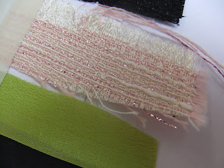
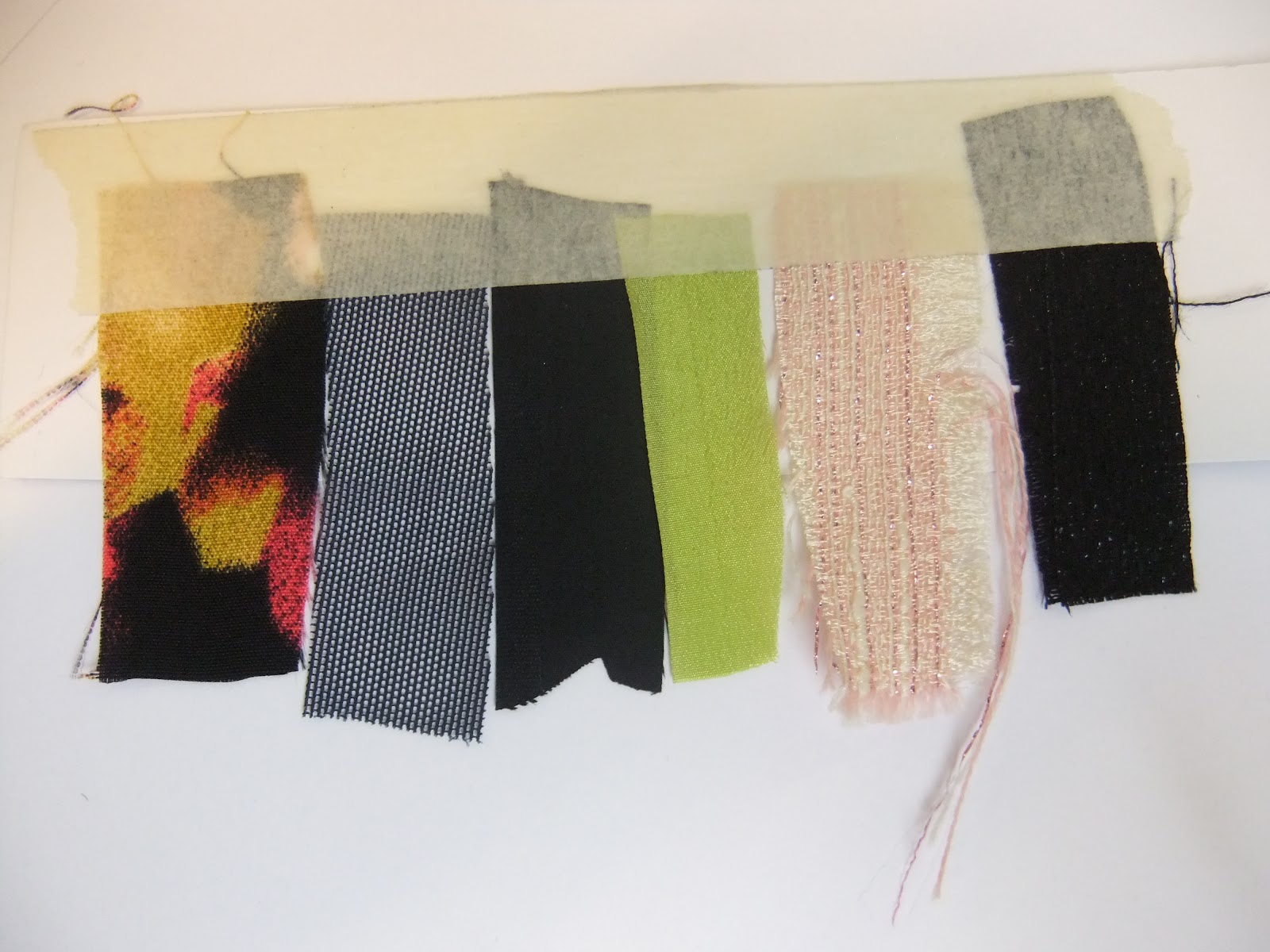
Brief 02 - Fashion Identity - Colour
Here are some more exact colour swatches, that I matched up with the Pantone books using material swatches from Lorin's 'Sacred Feminine' Collection, these will be the main colours used within the look-book and also maybe for Lorin's identity, as they are subtle and feminine colours.
Here are the material swatches:

The colours have are matched up to the nearest Pantone reference (some with a couple variations) for both Coated and Uncoated printing:


Here are the material swatches:
The colours have are matched up to the nearest Pantone reference (some with a couple variations) for both Coated and Uncoated printing:

The textures of the materials are also quite interesting as they involve various methods and materials such as digital print, mesh, silk, chiffon, weave. This could be taken into consideration when designing for the Sacred Feminine Collection:


Brief 01 - FA yearbook - Meeting
After having met up with the FA yearbook team here are some notes of what we are to do next:
-email Rachel with images that don't work and names
- logo - readability
- pattern - don't like
- want it more retro style
- bolder and more simplified
- try other than circle - rectangular - rounded corners, etc
- use of lien of froth with glitch
-tour information - preferably inside - too busy on back cover
-M-exhibition - layout - typeface for front
- Too many options - choose ones that work before pitching to FA team next time
- Include page number on layouts
NEXT MEETING - WEDNESDAY 9:30
Brief 01 - FA Yearbook - combining layouts
Here are Nick and Nats's layouts of which I need to put to combine in an indesign document along with my own and Gemma, to ensure they all are working to the grid rules (and typeface size, etc) and so that they work well together:
Nat:
Nat:
Saturday 10 March 2012
Brief 02 - Fashion Identity - Logo
I vectorised the logo and changes the weights and some of the curves, so I had. few variations to trace form
1. I don't feel this logo was working very well. So I chose to not retrace this and develop it.


Thursday 8 March 2012
Brief 02 - Fashion -Identity - Logo
I chose 6 logo ideas to take forward and develop, so I can present them to Lorin, and allow her to choose which she likes and what she thinks works best. I will experiment with using them with the typefaces too, to see how they work together. The logo's use the initials LS, in a subtle way, to represent Lorin Shepherdson. This is a norm in the fashion world to use initials as the logo, as people can recognise it easily and quickly relate it to the designer.
1. I chose this logo concept, that works with straight linear lines in a cubed form, representing Lorin's fragment structure and reflecting her architectural inspiration. The logo has potential to work well as a repeat pattern, and it can also be recognised form various angles. However, it may not be reflecting Lorin as a haute couture designer, as it doesn't seem to have that impact, and it isn't quite feminine. I will develop it and see how it can be used, to see if it works:

2. I chose this logo concept, with it fluid movement and subtle use of the LS initials, it can also be recognised upside down, to read in the same way. I will develop thus further as I think it has potential. However, it does remind me of cartoon of steam rising from a hot cup of tea! I will test this weights to see how this can improve:

3. I chose this logo concept again with the subtle use of the LS initials, however this time there are L's on each serif of the S. Which allows for readability at any angle. The logo is simple and elegant and has that fluid movement that relates to her Parisian architectural inspiration, that has the same curves. The use of their logo on an angle also gives a sort of diamond appearance, which represents importance.

4. I chose this logo concept, which is similar to the above however the Lines coming for the curves are longer, which frames the logo more. This gives a more 'sacred' feel to it, reflecting the exclusive designs. I think this logo has a lot of potential, and I am going to develop it to push it as far as I can. It has a 40's feel to it, as it is strong, bold and feminine:


1. I chose this logo concept, that works with straight linear lines in a cubed form, representing Lorin's fragment structure and reflecting her architectural inspiration. The logo has potential to work well as a repeat pattern, and it can also be recognised form various angles. However, it may not be reflecting Lorin as a haute couture designer, as it doesn't seem to have that impact, and it isn't quite feminine. I will develop it and see how it can be used, to see if it works:

2. I chose this logo concept, with it fluid movement and subtle use of the LS initials, it can also be recognised upside down, to read in the same way. I will develop thus further as I think it has potential. However, it does remind me of cartoon of steam rising from a hot cup of tea! I will test this weights to see how this can improve:
3. I chose this logo concept again with the subtle use of the LS initials, however this time there are L's on each serif of the S. Which allows for readability at any angle. The logo is simple and elegant and has that fluid movement that relates to her Parisian architectural inspiration, that has the same curves. The use of their logo on an angle also gives a sort of diamond appearance, which represents importance.
4. I chose this logo concept, which is similar to the above however the Lines coming for the curves are longer, which frames the logo more. This gives a more 'sacred' feel to it, reflecting the exclusive designs. I think this logo has a lot of potential, and I am going to develop it to push it as far as I can. It has a 40's feel to it, as it is strong, bold and feminine:
5. I chose this logo design, again similar to the above but with a border of two L's. The logo works at various angles and the frame gives it that importance that it needs:
6. I chose this logo design, as I have shown it to Lorin previously and she has liked it, but i said I would develop it further, yet also offer her various other logo design (above). It is simple and feminine, and used the LS initials subtly.
FMP Briefs - Plan
Here are my briefs more defined, with what I plan to do in the time available and also what I want to get out of them.
Brief 02 - Fashion - Mood Boards & Collection Inspiration
I asked Lorin to send me some image of her mood boards and of the Parisian architecture that inspired her collection, to give more of an idea of who she is and what she is about.
Here are the mood boards for Lorin's 'Sacred Feminine' Collection for Spring Summer 2012:


I converted the pantone codes into spot colours for print. However, these swatches were for the material, so have turned out slightly different, I will have to get some actual fabric swatches off Lorin, so I can match them up correctly to the colours that she wants.

Here are some images of the Parisian architecture that influenced her collection. I noticed the fluidity of the designs and the decorative element and painstaking attention to detail. I want to take this fluid, sophisticated, detail across into the 'Sacred Feminine' typeface, as a separate identity, but that also coincides with the Lorin Shepherdson identity, and compliments it. The Lorin Shepherdson identity itself will have to be quite simplistic yet elegant, to as not distract from the garments themselves, when it works alongside them. But the Sacred Feminine can be quite more detailed with an illustrative element.


She also included some shop fronts, with some nice type on the exterior signage:


Wednesday 7 March 2012
TYPE - Andrew Woodhead
Graphic designer Andrew Woodhead takes from his Parisian surroundings by consistently managing to make each typographic project truly elegant. Whether it is a logo or a full typeface, there is a running theme of experimentation and sophisticated stylistic choices that create Andrew’s cohesive style.


Brief - D&AD - Harry Pearce
Research into Harry Pearce - form an interview - Design Inaba
''our influences are not out of a book. The things that seem to steer our work are more to do with who we are, our life experience and pushing ourselves to actually understanding. By pushing yourself in different directions, you understand things from a wider perspective.''
''disappear for a while on an adventure. It makes you grow much more beneficially than sitting learning about graphic design or whatever your field is... there is work, but also everything else, and that it is really important to balance the two.''
Chases emotional work - beauty, emotions and things that move people
''The creative world has to see itself as an ecosystem. The more interdependent, the more collaborative, the richer and stronger it will get. Isolating yourself is the reverse of where everything is going. Your own personal growth also benefits from sharing and nurturing ideas with other people.''
''Witness keeps my balance. It is an incredible privilege to make enough money to live and spend every day, just from thinking of ideas and being involved in the creative process. Witness is my way of balancing that privilege. It is 18 years that I have been doing it and I haven’t just done the occasional poster, which is the sexy thing to do. I have actually made it part of the daily life of the team. ''
''when I was a teenager, I just wanted to bat for England.''
''I cannot ever manage stopping doing creative stuff of some sort every day, regardless of the commercial thing. I would just grind to a halt.''
''I am convinced that just by moving, just by walking down the street, you get unstuck. If I sit still too long, I just don’t get ideas but if I am walking, things just flood in... I find so many times that something happens accidentally and turns out to be the answer. It wasn’t my logical trip that took me to the answer; it was an accident that happened on the way that opened the door.''
''One thing that really paid off was that I was completely lost at college. I went to Canterbury and did a degree in graphic design. Then I had a couple of external tutors who pointed out a couple of people to me – one was Duchamp and one was Cassandre. A very weird mix, even if they’re both French! One was all about the mind, and one was all about images and words. ''
http://www.designindaba.com/article/harry-pearce-simon-sankarayya
In 2009 he published his collection of typographic puzzles, Conundrums
Brief 4 - D&AD - Concept Idea
If I was using the content that is personal information about the individual that people don't already know, made me think about how this could possibly work across the cover and keep consistency.
- What you don't know about... Harry Pearce
- Harry Pearce Uncovered
- letterforms under covers
- letterform shadows
- around the corner
- Secrets
- whisper
- Chinese whispers -message gets corrupted, letters change as the message gets to the next person - noise
- this could be through word ladders - which are engaging, or anagram (mixed up letterforms)
- Could be negative - implying that there a lies circulating about that individual and that is needs to be set straight - this is not really what I want to portray
Word ladder, for example -
Harry Pearce
Barry Peirce
Berry Pierce
Merry Fierce
Very Fierce
- this is quite negative - obviously need work if I was to use this idea.

- The truth about... Harry Pearce
- Minimal use of type on cover - using the least letterforms or extracts of letterforms
I was also thinking what could be done with the information I will be gathering:
- text
- language - passage about individual using the information
- quotes of the answers
- layout and positioning
- interview style - questions and answers
- imagery
- individuals work
- imagery to accompany text - relative to
- abstract - don't know what it is - same as you don't know the individual
- info graphics


Brief 4 - D&AD - Individuals information
What do people not already know about the individual?
Personal
- age
- origin
- hobbies
- hero
- likes
- dislikes
- describe yourself in one word
- tattoos?
- do you have a nickname?
- what are you afraid of?
- If you where stuck on a desert island and could only take done thing?
- who would you love to meet?
- do you have an accent?
- if you could have any superpower what would it be?
- best feature
Favourites
- quote
- person
- pantone colour
- typeface
- place (country, building, location)
- music (artist, band, genre)
- food
- drink
- film
- purchase
Work related
- what inspires them
- biggest accomplishment
- work most proud of
- if you could have designed anything, what would it be?
- who would you live to have as a client
Brief 4 - D&AD - Supplement content
The supplements are content driven, and what I find out about each individual professional is what is going to drive the design and this information is what will be used as the content. The supplement will be focusing mainly on type and layouts - as it is for The TYPOGRAPHIC Circle, so use of language will be important.
I looked into what information about the individuals could be used for the content:
- About the designer
- about their work and what they do (bio)
- area of focus - specialism
- their studio - how their practice works, location
- when they started out
- Showcase of their work
- photographic imagery
-Timeline
- Could be based on key points made at the talks at The Typographic Circle
- Personal
-what the individual looks like
- physical attributes/features
- age
- personality
- reserved but has beautiful work - so his would be the focus
- or is eccentric and gets involved with many things
What inspires them
- places they go
- hobbies
This has given me a starting point in what I can start to research and find out about the individuals, before I decide which angle to go into.
An more interesting angle would be looking into a personal approach for the supplements, as this may be the USP of the product as the consumer may more interested about the individual themselves rather than just about the work they have produced, as they will have seen their work before. This would more likely require sending out questionnaire and interviewing the individuals themselves.
So what do people want to know about these individuals, that they don't already know...
Tuesday 6 March 2012
Parisian Architecture
Art Deco and the Modern Movement (1918-39)
 At the end of World War I, a new aesthetic began to bubble up in Paris. It was optimistic—the world had just survived “the war to end all wars” and people were exuberant. Paris hummed with wealthy visitors and artistic innovations. High-speed ocean liners crisscrossed the Atlantic; Surrealism shocked the art world; radios poured out jazz music. The Modern Age had arrived. Trying to express this freedom and movement, architects responded to the jazzy rhythm with angular shapes reminiscent of the new cruise ships. Their style was termed Industrial Moderne, Jazz Moderne or Streamline Moderne; it was only in the 60s that the term Art Deco was coined, but this is the name that has stuck to the movement. Art Deco first appeared in Paris and reached its greatest heights in New York during the 20s and 30s. World War II put an end to Art Deco’s optimism; the less-flamboyant lines of pure Modernism took over. But at the beginning, in the 1920s in Paris, the two styles overlapped, particularly in private houses designed in newly-developing residential areas of Paris such as Boulogne and Montsouris.
There was a housing boom all over the city, especially at its edges. The city wall of Adolphe Thiers, built in 1851 and made obsolete soon afterwards when the city limits were changed by Haussmann, was finally completely demolished after World War I. The new empty space was quickly filled with housing projects, many of them government-sponsored and built of brick. The new housing was influenced by the sharp angles and setbacks of Art Deco, with decorative brickwork and intelligent layouts. These brick buildings became known as “the red belt,” because they were brick-colored and inhabited by socialist workers, in a belt at the edge of the city.
http://www.parisnotes.com/architecture/parisbuildings.html


Monday 5 March 2012
Brief 02 - Fashion Brand - Logo
Working with the name Lorin Shepherdson I experimented with the placement of the words


And also some pattern from the Nletters:


And also some pattern from the Nletters:
Not too sure if it's working very well I think a separate symbol would look better. Maybe using the initials, LS.
Subscribe to:
Posts (Atom)