Tuesday 31 January 2012

Bravo Company

pauline.ning is a fashion brand. The design are non-intrusive so the clothes stand out. They reused emboss mold to bring the production cost down.


The designs are simple and elegant, and do not take attention away from the clothes. This is reflected in the type used being simple, clear and clean.


 Business card, tags, flyer


 Look-book


By Invite Only is a handcrafted jewellery brand with a rustic art direction. To which they gave an old circus theme. The name card is in a carnival ticket style.


The type used name of the collection contrasts with the type used for the brand name, yet is still in keeping with this carnival/circus theme. The luxury aspect of the jewellery is represented within the use of print finish such as foiling and laser etching into wood, in these well considered designs. They are kept quite simple and you can see where were the circus element has been adapted in a subtle way. I really like the composition of the invite, and I also like the format of the look-book, I think this would work really well as a promotional giveaway for the fashion identity (brief 1)


 Necklace coilers


Look-book and invitation

Monday 30 January 2012

Brief 04 - The Typographic Circle - Written Brief

Here is the D&AD brief I have re-written. It is a more focused down version and is what I am going to work to.

The deadline for entry into the competition is Friday 9th March 2012, I will submit work for this, but I will also consider further developing the designs for module submission and also for my portfolio.

NHS - St Martins Practice - Meeting

Just had a quick briefing about the meeting which is arranged for next Monday at 3pm, at the practice.
We need to set a deadline with them for when we need to hand in our pitch boards. (A2/3 boards)

A few things I can start to design ideas for:

- logo - variations - colour
- how it could work over a range of media
- stationary
- wayfinding
- flyers
- leaflets

Together with the rest of the people who are interested in the brief we came up with a set of question that we want to ask at the meeting next Monday. And a few things for them to find out before we meet them.

To do:

- research into private practices, e.g. Bupa, how their branding works across media.
- initial design ideas

Design Context Presentation

The presentations are an opportunity to make focused decisions on what I am doing for FMP, and through explaining it to other people it will clarify it for myself. It will be following my SOI, and should try to include:

- umbrella statement - clarify what I am about
- chapters for DC publication
- subjects I am going to research
- designer/studio work that I like - the type of work I want to create
- design context I want to design for
- research activities
- design visits
- the things I need to find out [more] about
- what do I need to get out of it

I need to create a PDF or Powerpoint presentation consisting of 10 slides.
For each slide and point I am making I need to think in multiples (e.g. 10 studios, 10 activities, 10 events)

It is a chance to discuss my FMP, and get some feedback.


The hand in for SOI is Wednesday 31st January

Brief 01 - Yearbook - Format Considerations

Just found out that the format for the yearbook has to stay at 210 x 210 mm, to keep a consistency across all courses. So we have let Fine Art know this, as this was an issue that was brought up, as they preferred a more rectangular shaped, smaller format.

I tried to work out the page number considering the information that need to be included:
- Welcome/course philosophy - 1 page min.
- Course team - 1 page min.
- Exhibitors index page - 1 page min.
- 56 student pages
- Exhibition information (LCA and Free Range) - 1 page min.

Option 1:
If the students where to have 1 page each then the page total would be: 60
However, pages work in multiples of 16 so this would have to be brought up to: 64
Leaving 2 double page spreads, 4 single pages, or a double and two single pages left to work with.

Option 2:
If the students where to have a double page spread each then the page total would be: 116
Again, working in multiples of 16 would bring this up to: 128
Leaving 6 double page spreads left to work with.

Other content that could be used to fill these pages could include:
- Staff/visiting professional quotations
- photography of the FA studios
- Year-group photos
- blank page before on the first and last pages
- A separate page to explain the 'Original Rework' concept

This will be have to be discussed with the FA staff, to see what they would like to use the spare pages for, and if they would prefer the single or double page spreads.

Option 2 will take up more of the budget as there are twice as many pages, which means they may have to use a lower spec stock. Or if they wanted the high spec stock then Option 1 will be best suited.

When we get the publication mock-ups from Fred, we are going to take them across to FA and find out which they would prefer to give them an idea of the feel of each. So they can decide which option to choose.

Brief 01 - Yearbook -Meeting with Fine Art

We just had our first meeting with the Fine Art team to discuss ideas for the yearbook, and to ask some questions.

Considering the concept - they weren't too struck with the thirsty concept and the imagery we had used, as to them it seemed to narrative. They had their own concept/title for the exhibition which is, 'Original Rework', which vaguely means that everything has been down before but that they take their understanding of history and they 'rework' it and create their own original artwork.

The yearbook will be used for the LCA exhibition and also for the Free Range exhibition in London. For this they usually reference the London exhibition as 'Touring to:' The designs need to promote them, make them stand out and represent who they are as a course. They felt that last years yearbook was too typographical and that they prefer imagery on the cover, and they felt a bit lost at exhibition. Collateral will include yearbooks and possibly posters, leaflets and we also discussed bags for the printed materials to be carried in.

With regards to the yearbook. They had a few issues that need to be addressed. They liked the previous rectangle sized format over the 210 x 210mm square format as they feel it was more practical to carry. However the previous yearbooks of this size didn't have as many students so if they went with the double page spread for each student, then the book would be quite thick, as their are now 56 students (so that would be 112 pages) and they felt that this would lose the practical side to it, as they don't want it to be too bulky. The only way around this would be to use single pages for each student, but this obviously would not show off their work as well as a double. They asked for us to try and bring mock-ups to give them a feel of the double page spread thickness. We then showed them a landscape version of the rectangular shape, of which they seemed to like as they haven't used that format before. The landscape format would work well if the students were having single pages as the left and right pages seem more separate than on a portrait double spread. Also, they do not want any fold out pages and they do prefer to have spines rather than staples, with the text on the information on the spine too. We need to specify the number of pages that could be used for single and double page spread as they usually work in 16 page multiples - so we would have to let them know how many pages would be left over and what they could do with them.

They want to yearbook to be in full colour rather than black and white as they feel this best shows off their work. They would ideally like to use one image per student to sum them up. So for this we will need to specify to the students the quality of image, resolution, colour mode, file size, scale ratio. As they will be gathering the photos themselves before getting them to us. We gave them a deadline for everything they want in the book to get to us before Easter. But we are going to discuss creating a timeline for us and FA to work to, and push deadlines forward to get the project moving quicker so we can start designing and putting the yearbook together. But for now we will have to use image of previous work and dummy text.

They brought with them a piece of design work (Creamier - contemporary art in culture) that they were inspired by, which was quite typographical on the cover with text in black varnish, and the content was a newspaper style. The stock felt quite like newsprint but it seemed a bit better quality and the images printed were very high quality. The colour of the stock was pale orangey quite like the financial times newspaper, it was also unite thin, which means it would bring the thickness of the book down. They like the idea of having thin glossy stock as the colour of the images have more impact. They also like magazine format, which means the size would show off their work better yet wouldn't be too bulky due to the low gsm stock.

The student name could work in alphabetical order or it could just be what colour in the images work best next to each other. The content page could have the names in alphabetical order, so the students are easy to navigate and then the page numbers next to the names doesn't necessarily have to be in the right order - just were abouts they are in the book.

The information included will be the course philosophy, and on each student pages; their name, a 30-40 word summary of their work, their email address, website (if applicable) but no phone numbers. They would also like to include quotes off members of staff and professionals to give a feel for the course, however they are going to get back to us on who these quotes will be from.

They have gone away to further discuss their 'Original Rework' concept tight the rest of the year group and are going to get back to us at some point today so we can start to use this concept and come up with ideas on how to work with it, how it could work technically and ideas for the cover.

They do not want text over the image as they feel they detract front images. Typeface will follow from the concept.

We are going to meet up on Monday mornings to discuss progress each week. Depending on where we are up to we may need to meet up more than once each week, to keep them up to date.


To do:

- Specify page number - how many are going to be left over after 56 students double/single pages
- Stock options - what is best for high quality images but also to be quite thin.
- 'Original Rework' ideas
- Create a timeline - deadlines and project management - student images and 30-40 word statements
- Find out budget - and quantity of yearbook needed
- Format options - landscape, portrait (rectangular) - or does it have to be the 210 x 210 mm

Sunday 29 January 2012

Brief 01 - Yearbook - Layout Ideas


Some layout ideas I had for the yearbook, working with multiple images, and using these specifications:

- 210 x 210 mm format
- 12 column grid
- 3mm gutters
- 5mm margins with 10mm inside margin

The typeface used is:
- Title/Name - Univers Bold 14pt
- Body - Univers Light 9pt
- Contact - Univers Light 9pt

Friday 27 January 2012

Brief 04 - D&AD The Typographic Circle

Here is the fourth brief I have chosen brief. It is a D&AD competition issued by Pentagram and involves supplements to The Typographic Circle magazine, based around designers and professionals who have been speakers at their events.

I think this is an ideal brief, as it allows me to work with type, layout, grid systems, creating a publication/editorial piece for an existing magazine, and also to work with print finishes, stock, and giving the supplements an exclusive feel to them.

Brief 05 - Jewellery Brand Identity

Guerilla


'GONE required a high impact and high value document to celebrate the successes and provide a communication tool for the procurement of further European funding streams.
An oversize format was chosen to give the brochure standout and was created as a modular piece to have greater flexibility and longevity. It showcased individuals and their experiences through powerful black and white portrait photography and emotive copy, this was reflected in the brochure title, ‘Getting below the surface’.'


Thursday 26 January 2012

SOI & Design Context - Progress Surgery

Just had a progress surgery to discuss my SOI and DC publication. I need to present what I am going to do for FMP next week, so I need to rework a few parts of my SOI to focus it down. I also need to consider:

- DC publication chapters / sub categories
- Finalise 5 main briefs and specify any other briefs
- Umbrella statement - focus down
- Identify studios/designers who are doing what I want to do - identify what I like and why
- Focus down what 'high end' means

In the surgery, I managed to narrow my statement down to:

HIGH END TYPE AND LAYOUT FOR BRANDING, PRIMARILY FOR PRINT.

I feel that this is now focus, clear and what I am about at this moment in time.

Just need to find the last couple of briefs that will allow me to explore this.

Graphic Design for Fashion (Book)


Hess, J. (2010) Graphic Design for Fashion. London: Laurence King.

Fashion Graphics (Book)


Baruel, L. (2009) Fashion Graphics. Asia: Page One.

Print Formats and Finishes (Book)


Print Formats and Finishes (2010) Switzerland: RotoVision SA

Victoria Secret by Limited Brand


Wednesday 25 January 2012

Design Context Publication - Possible Chapters

Here are a few ideas that I had for possible chapters and sub categories:

- Inspiration
   - designers / studios
   - people
   - places

- Great Advice
   - personal advice that I have received
   - designer quotes
   - advice for when you have a designers block

- Typeface
   -My top 10 that I will use - why and what they work best for

- Branding
   - Brand
   - Identity
   - Logo
   (the distinctions between the three, how they work, and how they can be effective)

- High End - design
   - luxury
   - exclusive
   - fashion
   - lifestyle

- Print Process
   - printing methods 
   - print finishes - why they are effective,a dn for what are they used

- Rules
   - design fundamentals e.g. type, layout
   - the grid system - methods e.g. the golden section, rule of thirds
   - use of colour

- Goals
   - Milestones and goals that I aim to achieve
   - Plan

214 magazine

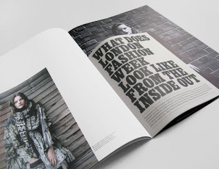
A magazine promoting New Generation Fashion designers showing during London Fashion Week. Magazine in two sections, outer, and smaller insert, dividing up content. Photography by Ben Toms.

Taking some inspiration for the fashion look-book and promotional material for Lorin. I really like the concertina fold leaflet, this could work really well for showcasing her collection as something that people can keep.


Lesley Moore

Tuttobene '07 ~ all-in-one newspaper


LesleyMoore


The newspaper has a clever concept. And also offers use in a different context than an ordinary newspaper.


Why Not Associates

Envy - Corporate identity, for London based post production facility. Showing the identity running across a range of deliverables: including letterhead, business card, compliments slip, cd packaging, note books, bellybands, video labels and packaging, tags. 

Gives me something to consider when creating the brand identity for the fashion designer, to experiment with how the identity can be used across a range of promotional materials in different ways.


The Reel - Corporate identity for xtreme information's media resource service showcasing commercials and promos. 

Nice bit of branding across the stationary. The editorial zines are very consistency, and vibrant.


Pigeons & Peacocks - 
Third issue of the magazine created for the london college of fashion.

The magazine represent the work of students at the london college of fashion. This is relevant to my yearbook design brief as it is of similar content. I like the layout of the images with some working to the margins and other going off the pages. The yearbook is going to have to have different layouts to suit the work of the students, so that it shows their work off in the best way. This may include one large single images, or 2/3 showing different aspects of their work. So looking at how their composition works with in the grid system is something I need to experiment with.
I also like the cover of the magazine with the monotone images and the foiling.


Pigeons & Peacocks - 
Quarterly fanzine for london college of fashion showcasing students work.

These work as a fold out poster/zine. They are each very different yet keep a consistency through the use of the same grid system, typeface and format.


London College of Fashion -
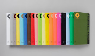
Prospectuses 09 - Including cover, bags, and spreads.

Use of colour to distinguish each different publication. When thinking of how this could relate to the yearbook, the use of packaging for it could be visually interesting, either a bag or even a poster wrap.