Here are the final drawings for the 10 diamond shape phrases that work the best. They are now ready to be vectorised, however I will try them in both the thin line, and also the ones where the word for the diamond shape is bold, standing out from the rest of the text.
After a quick live trace of the drawings, it is clear to see the ones with the bold type for the diamond shape name, are the ones to stand out more. They just need a touch up to make the edges smoother and to make sure they are in the right shape.
Monday, 30 April 2012
Brief 06 - Design Context - Research
I was really inspired by the layout of Vice Magazine, and the way it composites the text with the images given them clarity and space. I also really like the large, bold titles:
DC Context
DC Context
Brief 06 - Design Context - Content
Here is the rest of the content that I am going to use as text within my book align with the interviews:
DC Content Info
Brief 06 - Design Context - Interviews
Here are the questions I sent out to a few studios and the ones I got back from:
Craig Ward - Words are Pictures
Andy Bone - FOUR IV
Brett Phillips - 3 Deep
DC Interviews
Brief 01 - FA Yearbook - Meeting
Noted and decision from the FA meeting:
- got back proof read copy - need to make changes (Me)
- thanks page - Sam Vince not Vine
- Adam Jenkins - email needs changing o black
- Charlotte Wilson - lien on image
- logo on back of cover
- special projects (Nick)
- envelopes for flyer invites
- format for flyer - square/ letterbox (Gemma)
- large posters A1
Flyers gettign mailed out on 1st June
Brief 04 - D&AD Ideas
Ideas for the supplement:
Experimenting with how the type could work. The name for the supplement that I am go gin to use is 'Designed For Life', as they are people form within the design industry and the supplement are all about who they are and the work they have produced in their life.
D&ADIdeas
I had the idea of using the information about the speakers and creating a fold out poster. So that the name of the speaker can be seen on the cover align with 'Designed for life', and then it fold out twice to reveal information about the person, and then a list of their work of which opens into a fold out poster as a collection of their work. I am go gin to use the colour schemes from the posters that were given out for each person talk at the Typographic Circle, to keep it all tied in together:
Harry Pearce - Red white grey
Rian Hughes: purple black
Simon Esterson - yellow and black
D&AD Test 01
Saturday, 28 April 2012
Friday, 27 April 2012
Brief 02 - Fashion Brand - Stationary
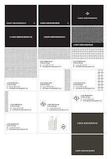
Adapting the logo across the letterhead, business card and stationary, I tried to keep a consistency within the concept.
Business cards:
Business cards:
Open publication - Free publishing - More letterhead
Compliments:
Front-
Back-
After pitching these ideas to Lorin, she gave me some feedback as to what direction to go in. She liked the pattern on the back of the compliments slip and letterhead but though it was too much on the business card as it was making it look too busy. And she said she liked to pattern better in a larger scale as the smaller pattern makes your eyes go funny. She picked out these two business cards that she likes the most and asked me to reproduce them in black and white inverses and also double sided, on a thicker stock. They are both different versions of the usage of the symbol so she wanted me to further experiment with applying them before she chooses which she likes better
The logos she chose where both the centre aligned ones so I suggested that the logo could work better on the letterhead and compliments if it was centre aligned too so I would go away and try it. I also said I would experiment with the type for the contact info as it was Georgia and was clashing with the serif of the logo. Maybe a nice sans serif such as Gill Sans would work better.
Brief 03 - St Martins - Door signs
Here are the designs for the doctor's door signs, I played around with the type before I decided on the italic type, so that it is different to the logo. I also wanted to design a clipboard for staff usage so I lazer cut the logo onto this too:
Brief 03 - St Martins Lazer cut signs
Brief 03 - St Martins Lazer cut signs
Thursday, 26 April 2012
Brief 01 - FA Yearbook - Meeting
Here are some changes to the layout - this includes a gradient of colour of the names of each student in the contents page. We showed this to Fine Art, who then pretend out a copy however they weren't sure about the colour gradient as it had too many beige and brown colour. They sent us away to work at the colours taken from each student images, and advised us to used brighter more striking colours for the names on each page, but not to use it on the contents - just keep this black:
Open publication - Free publishing - More layout
They also mentioned the spacial projects that we had done - that they prefer the images in sepia/antique in full bleed
- exhibition times - need correcting
- proof reading - by fine art
- images - Rachel Worthington, Adam Jenkins, Rebecca Norman (need new)
-include LCA logo on back
They also mentioned the spacial projects that we had done - that they prefer the images in sepia/antique in full bleed
- exhibition times - need correcting
- proof reading - by fine art
- images - Rachel Worthington, Adam Jenkins, Rebecca Norman (need new)
-include LCA logo on back
Wednesday, 25 April 2012
Brief 05 - Jewellery Brand - Diamond Phrase Visuals
I had to work out the composition of the words for each phrases before I created the diamond shape around them:
I marked off the ones I think worked the best for each shape. But a few more tweaks need to be made before they will be right for vectoring.
Subscribe to:
Posts (Atom)


